
I’ve been looking and thinking and looking at the work of Paul Rand this week (and reading through Steven Heller’s excellent book on him). One of the 20th century’s most storied and accomplished graphic designers, Rand (1914-1996) influenced American visual communication in myriad ways. From his early days in advertising, leading on to commercial work with book covers, packaging and billboards, progressing to sophisticated, corporate branding on a vast scale, he created an immediacy with his audiences in all aspects of his work. Vibrant, dynamic, and fun!


In the 1930’s, he introduced a spare and spacious European avant-grade aesthetic to the American public through his advertising work. Until Rand came along, ads were created by illustrators, who drew the images, and typographers, who created the hand-drawn type, competing with each other in one small space with their pretty pictures and jazzy type.
Rand realized that an ad could be so much more, using so much less. Eliminating superfluous information, too, he created bold, simple designs to create a cohesive, highly communicative image.


Known for his corporate branding, Rand’s logos will be familiar to many, with some of his most famous logos; designed decades ago and still in use today, a testament to their power and his great skill.


His book covers revolutionized the publishing industry, with their imaginative design and his equally creative use of typography. They pretty nearly lept off the shelves of book stores, shouting to be picked up and read. Rand was inventing a new visual language, and the Madison Avenue advertising agencies sat up and took notice, making Rand an extremely successful leader within his field.


One of the many things I love about Rand’s work is his sense of simple, but stringent playfulness. From his charming use of colour, typography and often an imaginatively illustrated character or two (which he personally executed), he brought a lot of visual wit and fun to a very wide audience, regardless of whether it was for selling soap, cigars or face powder…


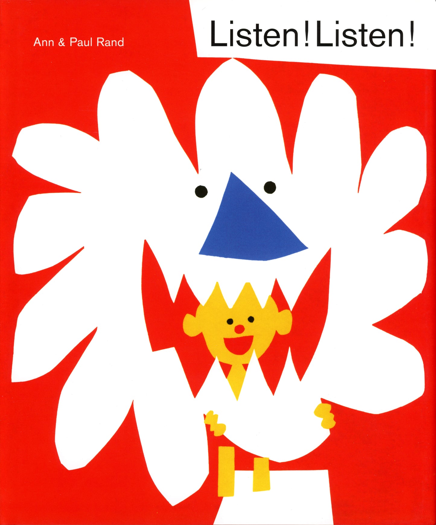
Rand and his architect wife Anne collaborated on a number of wonderful children’s books, with Rand’s iconic cut paper style. Bold, graphic and ever so contemporary, they delight on so many levels. We have so much to learn from this graphic design master and innovator of visual communication.


There’s an interesting article on him in Wired Magazine here. Check out LetterForm Archive too, and a very thoughtful article on him over at The Marginalian. Also, a wonderful, short video, as told by Randy Golden, former Senior Program Manager, IBM Corporate Brand Architecture and Design, on working with Rand.


We would expect nothing less to mark the life and death of this extraordinary, prolific, graphic master than with the most elegant of tombstones…
